So what is new this week?
Last week, and my task was Generating Stage Unlock Values, which now works very well, saving me lots of time. I have found that playtesting demonstrates that the stages are indeed challenging.
Continuing on this week, I have been doing a pass on the Scoring system, ensuring that scores work as desired, as a few changes have occurred since it’s first implementation. Initially, I had scores focusing on hi-scores per stage. This changed. Current focus is (a) scores to unlock the next level, and (b) the cumulative score across the whole 12 stages.
With this in mind, I overhauled the score functions, ensuring that when hi-scores were reached, the game would display visual indicators, a hi-score ‘crown’ icon added to ingame gui and a hi-score indicator added to Level Complete panels.
More playtesting was necessary to iron out some bugs, and ensure the hi-scores were saving to the Main Menu properly, and then I added the Debug ‘Reset Hiscore’ function, which lets me clear the score for retesting purposes. With the Score pass completed, a quick code tidy and saving the build, I then prepared for the next task – replacing placeholder game objects, with some finished art and visuals.
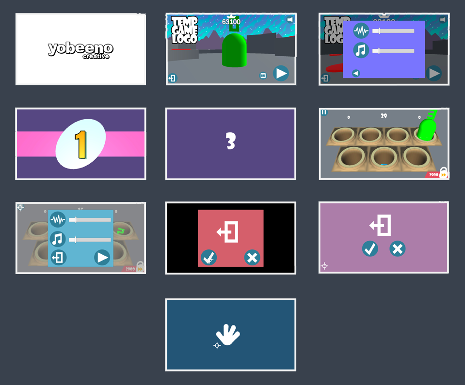
I ran the game again, snapping some screen captures of all my Canvases, the Main Menu scene and an ingame scene, and then saving them all to one large image for some concept-art and image manipulation. I had a rough idea what I wanted the game to look like, but I wanted to put together a mood board first, to explore the look and feel, before I settled on any one aesthetic.
Next, I began to make a List of Art Tasks to complete. I already have a list of art-related bugs which will add to the list, but I needed to itemise the art content required, so I could systematically concept and build items using a ‘productive’ workflow, maximising my time.
Example: Regular Targets are going to be variations of a Base Character, a cutesy 6-armed alien, but there will be different flesh colours, costumes, and texture of this guy, to create the impression of a wide race of aliens.
Below is my initial List of Art Tasks – Concept Art Pass.
Concept Art Pass
General Look and Feel
- Characters Mood Board
- Environment Mood Board
Character Concept Design
- Regular Target – Base Character and variants
- Avoid Target
- Bonus Target
- Lobber Target
- Boss Target
Environment Design
- Determine the Visual Story Progression across stages
- List General Environment Objects
- List any Special Environment Objects
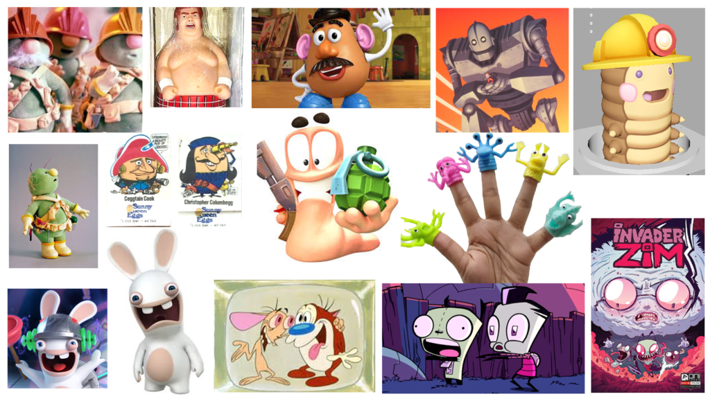
I started with a Character Mood Board (image below), to roughly establish a very general art direction which I can turn to while creating, comparing my work to this. Ie: Does this asset ‘fit’ in the overall look and feel. I was looking at several design aspects while compiling these images, line, shape, space, value, form, texture, and colour.
Why did I choose these particular images?
The Doozers in Jim Henson’s Fraggle Rock are builder characters, who would build intricate underground structures that the Fraggles would indiscriminately ‘munch on’. Visually, they all looked basically the same, but with small costume differences, so I added the Doozers for an example of colour palette and costume changes creating variation and re-usability across the character set. BTW, Mr Potato head was also added for similar reasons – using a library of attachable objects, to create many costume variations.
Shape was also considered, (a) Initially for functionality, as the targets need to basically conform to a capsule shape that can pop out of the target positions. I thought about using Finger Puppet shapes, but thought of the targets as squishy, smackable forms. The secondary consideration for use of Shape was (b) for establishing uniqueness of visual style.
The Rabbids characters were added, because I liked how a ‘weird looking rabbit’ appears, with variant costume changes, manic facial expressions, whilst still retaining those key details that visibly identify them as a rabbit.
Finally, the top-right model was added, as it was my first initial 3d model, exploring the type of Regular Target character. It needs some minor changes to suit visual style, but it a certainly a ‘base’ for where my regular target is heading.
Some Thoughts on My Art Direction
I had a quick peruse at online visuals of many indie games that people were making, and the overall visual feel felt very ‘samey’, and gave me an instant orientation of what I didn’t want to create. They were pretty, but clearly used similar art influences, processes and tools.
As a technical artist, I’m seeking an art challenge. Back when I was learned to make game art, the goals were to make things look good, with limited texture budget, less polys, hence saving memory. While modern engines have more bandwidth for larger textures and more polys, I still prefer to demonstrate ‘limitation’ as an artistic and technical challenge, and show what I can do with the least possible resources. As a byproduct, limitation assists in the art production process, reducing time per asset, which is infinitely useful for a small scope game. I can ‘allude’ to more, while using less.
While many games are currently aiming for highly rendered graphics, I wanted simple and clever art, using bright, punchy colours, similar to a ‘retro’ palette, and using interesting design elements like shape and form to project a fresh look at familiar concepts. I want to capitalise on a tool-set of clever game art tricks to get better bang for buck, keeping the overall game fast, and low in memory size.
Next Week: Environment Mood Board